Design a High Converting WooCommerce Checkout Page with Beaver Builder
Last updated February 1, 2018 · Yashwardhan Rana

Do you know that on an average 27% of US online shoppers have abandoned an order in the past quarter solely due to “too long/complicated checkout process”? (source: Baymard Institute)
It means that out of every four customers, there is a possibility that you might be losing out on one, just because of a tedious and boring checkout page. This can become quite an issue for any business who is trying to make an online sale and that too just because of an ill-designed checkout page.
This bitter fact of the e-commerce world has troubled many businesses since the beginning but now it is time to change that.
Having a functional and straightforward checkout page is important for improving sales but how your checkout page looks, plays a huge part in it too. So, an ideal checkout page must maintain a proper balance between looks and functionality.
10 Tips to build a High Converting Checkout Page
Before getting to designing, we must understand the elements or attributes that make a checkout page the way it should be. There is no thumb rule to a good checkout page, it all depends on what kind of products you are selling, the theme of your website, and other factors as well. Let’s have a look at the factors that make a checkout page better-
1. Clean and Simple Layout
This is an obvious one yet often ignored. The checkout page should be made with minimal design focusing on lesser diversions and more streamlined arrangement. The potential customer should not feel intimidated at all while checking out as it will only pull the customer from buying the product. Also, you should restrain from adding any promotions or recommendations from the Checkout page. If you want to recommend something to your customer, do it on the cart page.
2. Build Trust with Security Seals
Include security seals and credit card logos on your website, this will create a sense of trust and let your customer know that your website is a trusted place to do business. You need to make your customers understand that their payment information will not be compromised.
3. Provide/Enable Guest Checkout option
There is nothing more annoying than seeing a “Login or Create an account” popup when you are about to make a purchase. Keep an option for guest login and remind them to fill in their details to track the product once the purchase is done. Customers would gladly give their contact information and create an account once they have made a purchase.
4. Allow Sharing Cart Contents
Have you ever considered that what if the person buying the product is not the end customer? There are many cases where agencies make purchases on behalf of their clients or they need a formal signoff from their boss to complete the process. In such scenario, providing an option to share the cart contents smoothens the process a lot.
5. Display items and item Totals
Give your customers a last chance to review the products and confirm the information they have entered before proceeding with their order. Let them know the important details such as size, color, version, or any other information that might be crucial relating to the product and ensure them that they have made the correct selection.
6. Prominent Call to Action Buttons
The CTA of the Checkout Page is the Buy Now/Purchase button. In the end, it all boils down to this button. You must make sure that the Buy Now button is appealing enough to lure the customer to click on it. Avoid using striking colors such as pitch red and black unless they match with the theme of your website. Include hover effects to the button and other animation effects that will boost the conversions of the Checkout page.
7. Properly Style the Input Fields & Labels
One other important thing that you should make sure of is that labels are styled properly. There should be proper spacing between input fields and sections. The way your checkout page’s elements are arranged matters a lot. Try removing unnecessary information from the page and add placeholders in the fields notifying the user about what information has to be entered in them.
8. Two Column vs One Column Layout
This attribute depends on your website and the kind of product that you are selling. This also depends on the number of products your average customer purchases at a time. You can try both layouts and apply the one that suits your website better.
9. Remove unwanted fields
Another thing that bugs the user is bombing them with loads of data fields. Asking unnecessary information is another thing which will end up with annoying the user. If you have taken Email, try to avoid forcing the customer to give their phone number as well. You can remove additional fields or just set them to be non-mandatory which will do the job too. Just make sure you ask for the information you REALLY need and the information does not fall into the “nice to have” category and lead to a useless and bulky database.
10. Maintain Transparency
If you ask the user for information that they might be reluctant to give you then tell them why you are asking for that specific info. You can add a description of the field but make sure it is terse, to the point and not too much wordy. For example, if you are asking for Date of birth of your user, let them know the proper reason for the same such as “We offer special birthday bonuses to our loyal customers”.
There are many other proven methods as well but the ones mentioned above will surely show some prominent improvements in your conversions. Also, I am sure by this point we are through with all the things that you need to add and modify on your website’s Checkout page. Let’s see how you can do that as well!
Design a High Converting WooCommerce Checkout Page with Beaver Builder
Beaver Builder allows you to create flexible page layouts. We built, WooPack – an addon for Beaver Builder which gives you the flexibility to style WooCommerce Cart & Checkout pages along with few more features.
What is WooPack?
WooPack is an add-on for Beaver Builder and WooCommerce. This addon once installed and activated will unleash a whole new level of customization for your WooCommerce Store.
WooPack comes with many modules like Cart, Product grid, Product carousel, Checkout, etc. and you can change almost every attribute of these modules using the module settings.
Since now we are aware of the tool, let’s understand how we can style our checkout page using the tool.
How to Style your WooCommerce Checkout Page using WooPack?
To style your Checkout page, first, make sure you have all the following plugins installed and activated-
Once done, we can begin designing our Checkout page.
Here, we will learn How to design and alter the checkout page of WooCommerce using the WooPack and Beaver Builder.
Firstly, open the Checkout page of the WooCommerce in page editor or simply make a new checkout page. In the page builder, if you see any contents, simply remove them. We will start from scratch here.
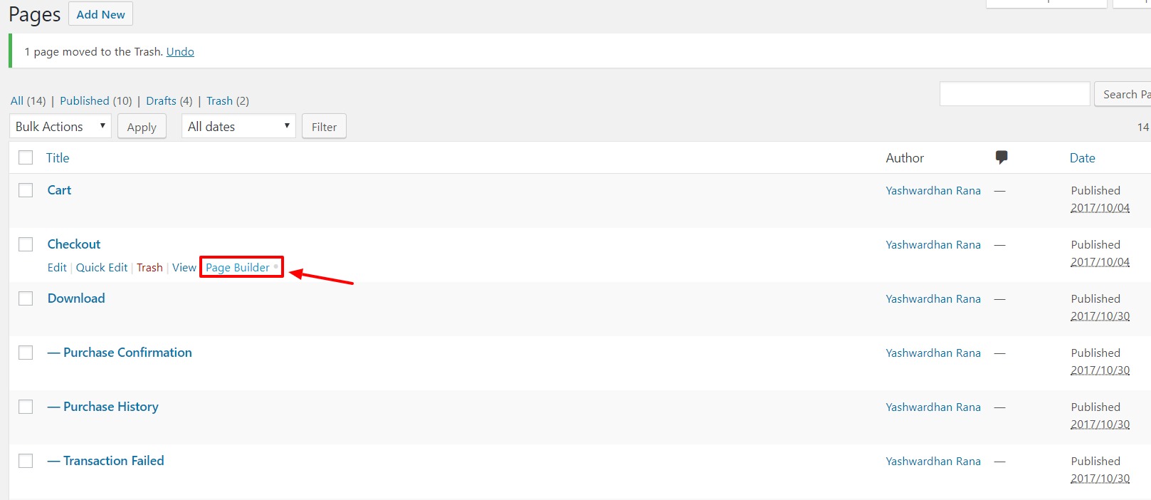
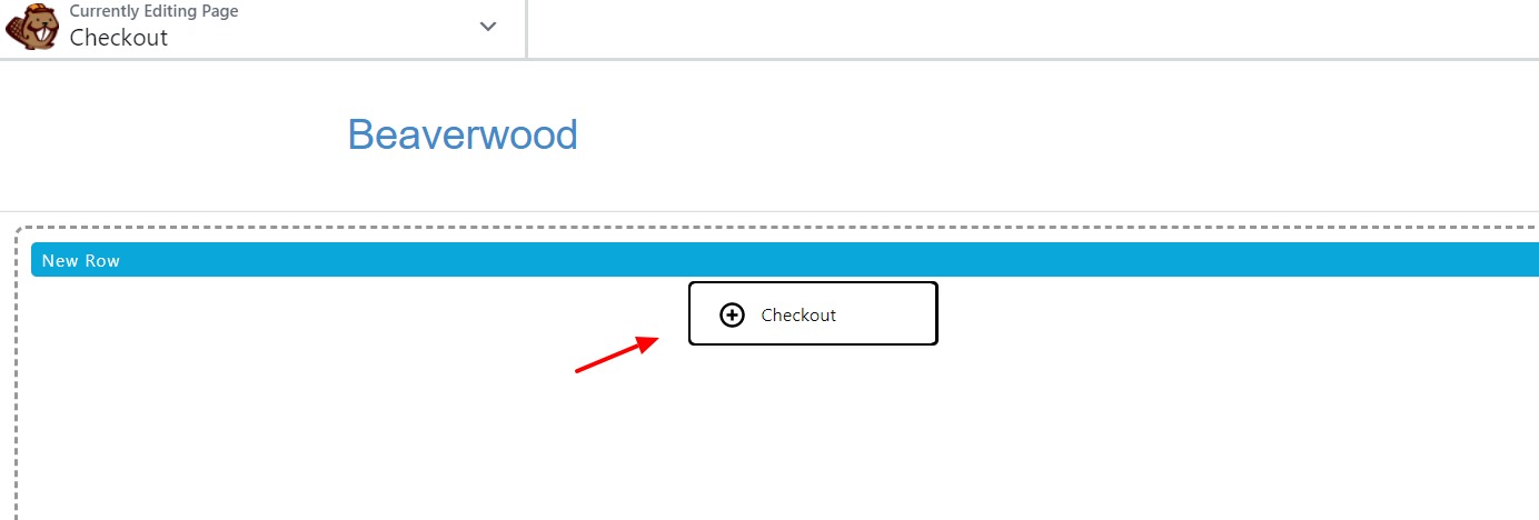
Now, once you are in the page builder, drag and drop the Checkout Module from the WooPack Modules pack on the page.
Note: If you are not able to see the Checkout module on the page it can be because there are no products in the cart. You can just go ahead and add a dummy product to the cart and resume your cart editing and designing.
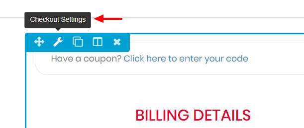
Now comes the actual designing part. To begin with, click on the little wrench icon on the top left corner of the module to enter its settings.
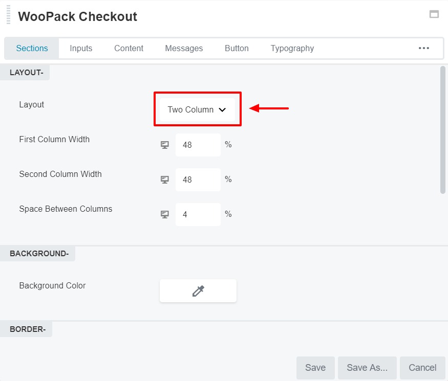
Let’s start with the layout. Change the Layout of the page from 2 column to single column layout or vice versa. Single column layout increases readability and displays a better flow of the information.
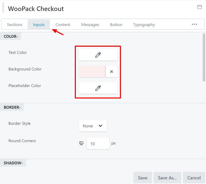
Now we need to update the input fields. Change the border, background and text color according to the theme of your website. You can even enable/disable & change the shadow, height, padding, and margins here. If you wish to make any changes to the checkout page’s attributes, you can do it in the Content tab. You can change the spacing color, background and other attributes of Cart Heading, Cart Item, and Payment Method sections.
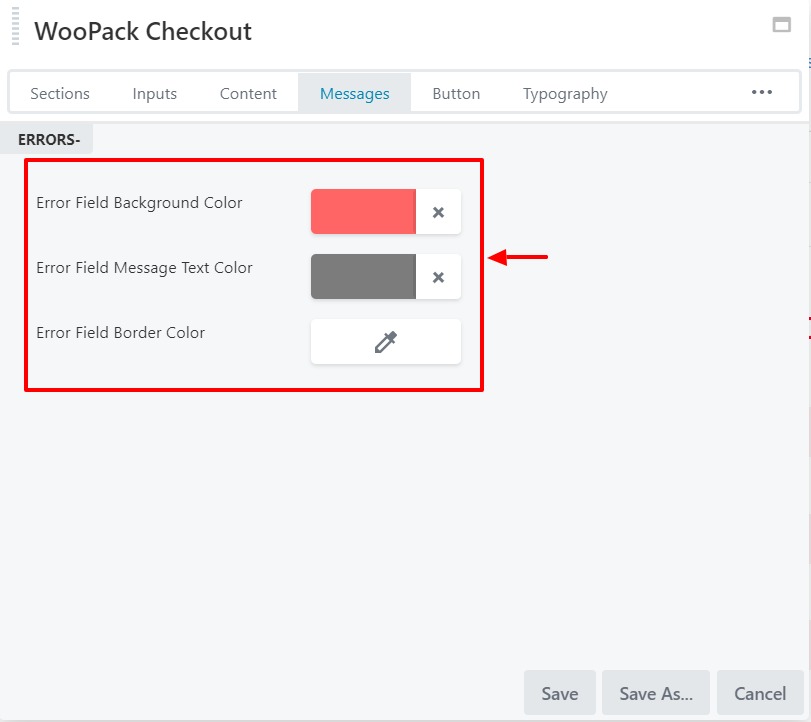
One of the reason for the user to get irritated is when they are getting a wrong field input error, but they are not able to identify which field is the wrong one. You need to emphasize on such fields, and that is what the Messages tab is for. You can change the error fields background color and text color here to whichever color you like. Make sure that the color you choose can grab their attention but not too much flashy or striking that it irritates the user.
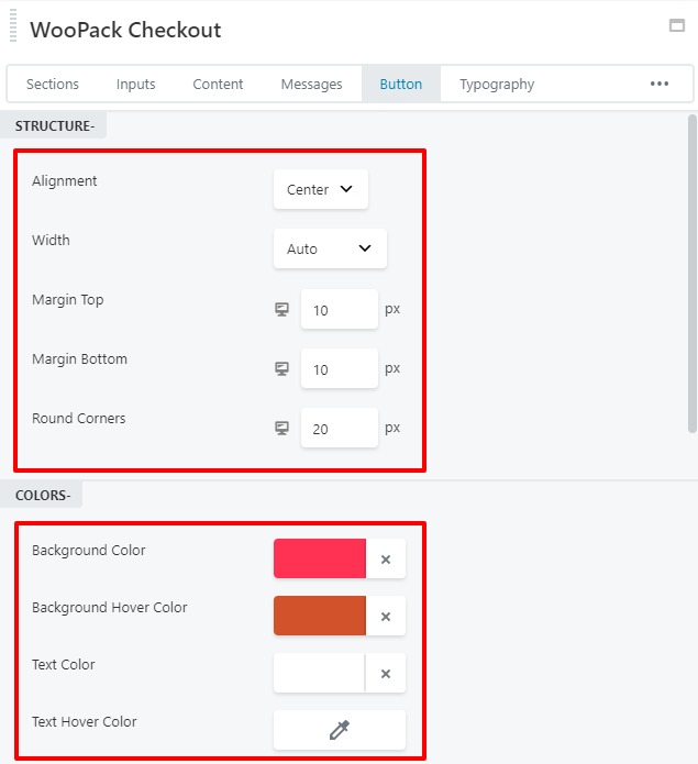
Now comes the designing of the most critical part, the Buy button. You can make numerous change to the button like adjustment, color, placement, design, borders, etc. Just make sure that the button has eye-pleasing colors and welcoming and straightforward design. Avoid using striking and colors that represent danger or negativity like pitch red, black like we discussed earlier.
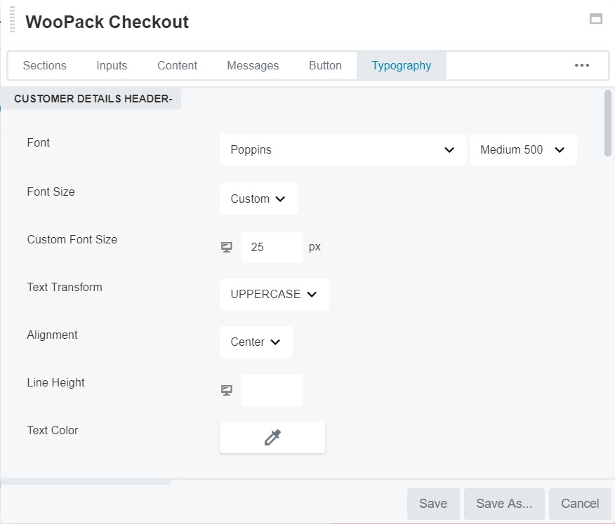
Last but not the least is making changes to different parts of text on the page. For this, the typography tab will be useful here. You can change the font family, style, size, format, color, etc. from this tab and you can view the changes in real time as well.
Once you have done all the changes, you can go ahead and publish the page by clicking on the Done > Publish button at the top right corner of the page. Your page is ready.
If you have created a new page and not edited the old existing one, you need to perform one more step.
We need to tell WooCommerce that this page is going to be your new checkout page. To do that, go to wp-admin > WooCommerce > Settings. Click on the Checkout tab and in the Checkout pages section, select the name of your page from the list on the checkout page. Once selected, click on the save changes button.

Congratulations!! You have just beautified the most crucial section of your shop!
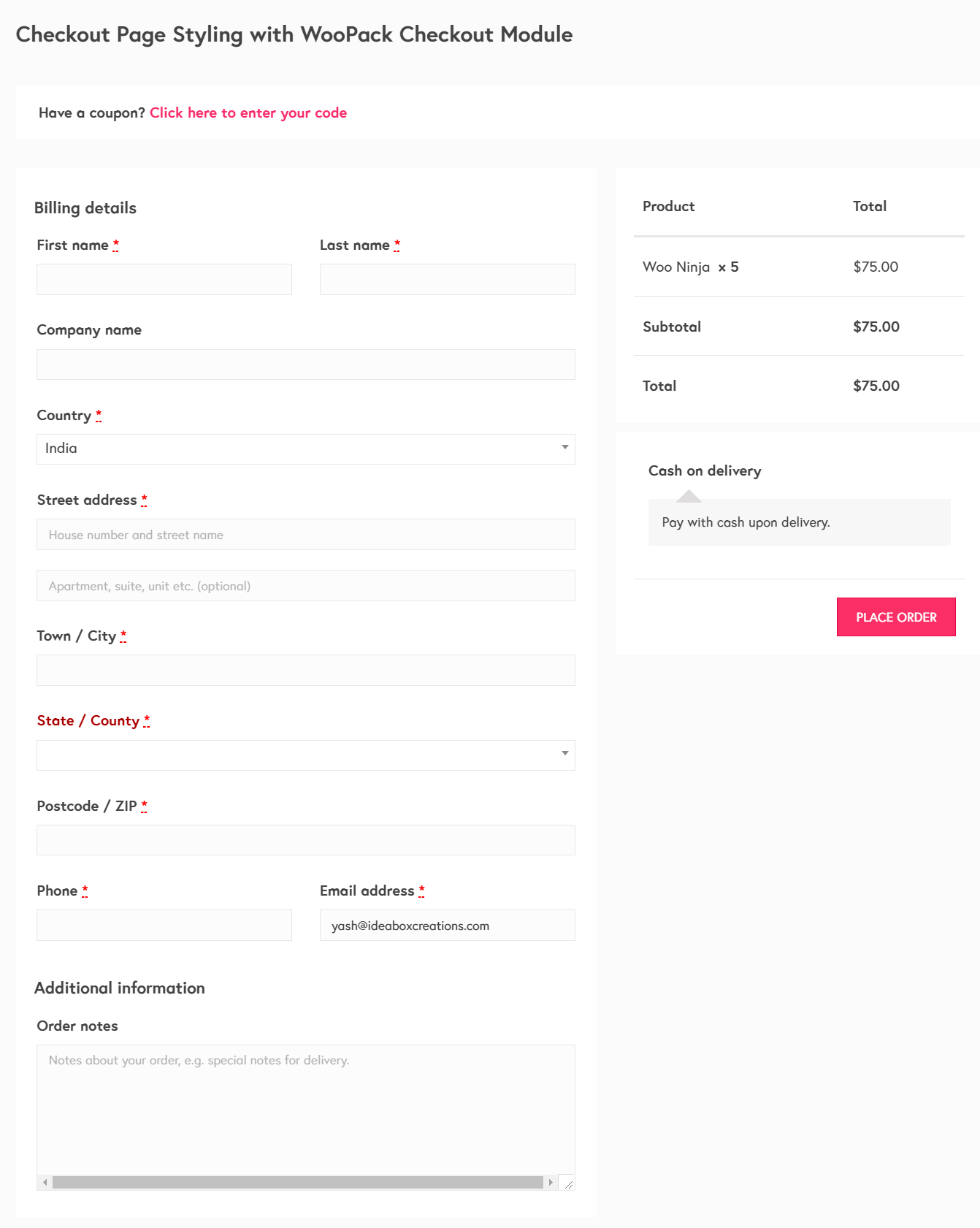
Here is a screenshot of the Checkout page that you can make with WooPack
Want to do more?
You know, styling the checkout menu is not the only thing the that you can do with the WooPack. You can design your products page, cart page, product grid and even the add to cart button along with displaying a product carousel. With the WooPack, you can style all the aspects of your WooShop without touching a single line of code!
Now, who wants to miss out on that?
If you want to take this customization power in your hands, Get the WooPack Today! If you think that this piece of information is useful, do share it!
Do you have any queries? Comment them down, and I will get back to you ASAP! 🙂
A few more interesting posts →
2 Comments
Leave a Comment

PowerPack Beaver Addons
Start creating beautiful websites with 65+ modules and 350+ templates for Beaver Builder.
In the demo for the product detail page is missing a selection field for product variables like color or size, etc. Or did I overlook that?