Devices Module
Devices module lets you add device frames to your pages for beautifully showcasing your web designs or portfolio to your clients.
Features of Devices Module for Beaver Builder:
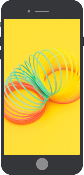
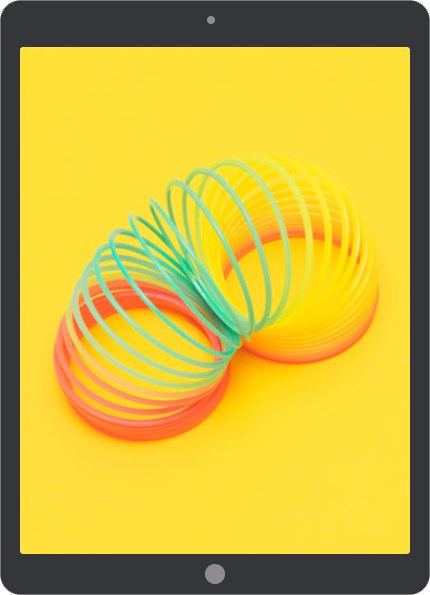
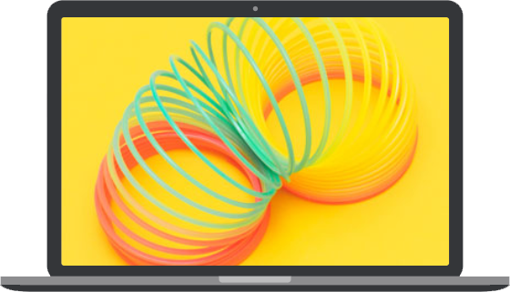
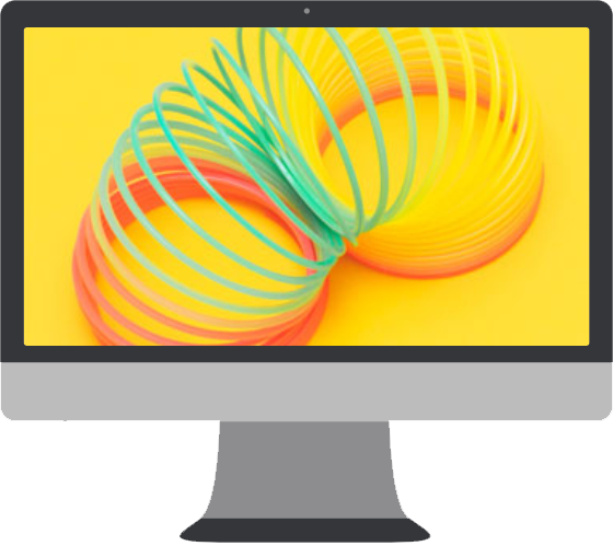
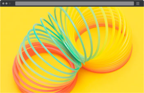
DEVICE TYPES Multiple Device Types
Simulates multiple device frames to your screenshots or videos.
Devices Module works flawlessly with six types of devices: Phone, Tablet, Laptop, Desktop & Browser Tab.
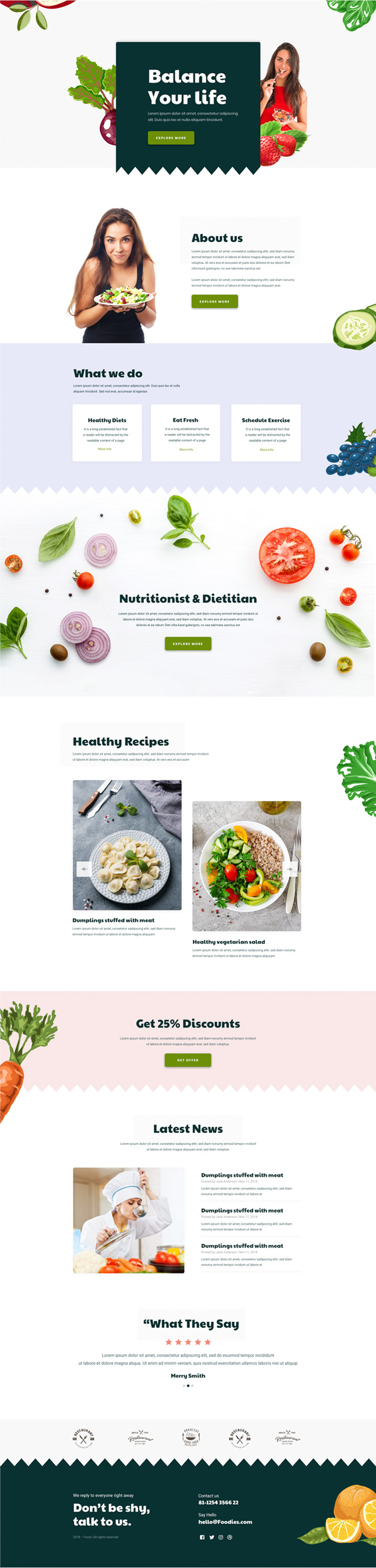
You can easily display images & videos in one of these device frames.

STYLING
Device
Customization
Choose from the custom style or can customize devices skin as per your choice.
You can also choose from the 5 pre-defined devices skin: Rose Gold, Jet Black, Black, Silver, and Gold.
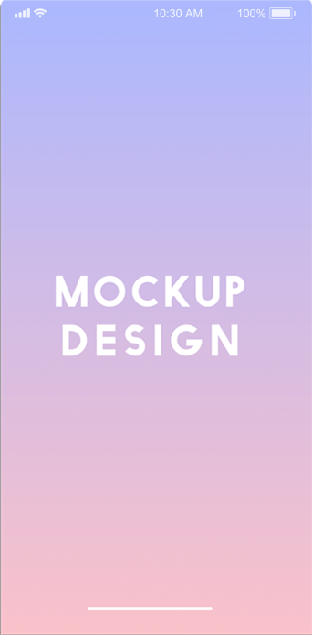
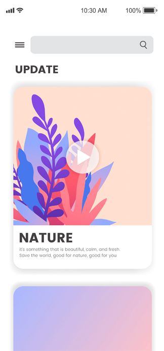
flexibility Scrollable Image
The image fit type & scrolling feature of this module makes it easy for you to present your work flawlessly.
To check its scrolling feature, you can scroll image on the left within the device.
layout Orientation Control
Devices Module comes with full orientation control feature. It allows users to choose between landscape or portrait view for mobile and tablet devices.
This feature provides excellent opportunities to create a better user experience. It gives flexibility to the user to switch orientation between portrait and landscape modes.

multiple Media Types
This module supports both Image & Video Media type. You can easily add devices frame to screenshots as well as videos.
It supports multiple media sources. You can easily add the videos from YouTube, Vimeo, Dailymotion or even, self-hosted videos.
styling
Advanced Video Player
Customization
For Self-hosted Video Media type, we have extensive styling options. You can easily customize the play button icon, choose a custom cover image, and many more.
Get Access to 400+ Beautiful Templates & 90+ Creative Modules.
Buy worry free with our 14-Days Money Back Guarantee.