Beaver gets smarter with Modal Box & White Label features!
Last updated October 13, 2016 · Puneet

The PowerPack Beaver Builder add-on journey has been amazing so far! We have been putting our best efforts every day to bring the best to you. In last few days, we worked on building some really cool features.
Today, we are launching PowerPack addon with the Modal Box Module and White Label options. There’s no extra cost involved!
Yes, you heard it right.
Now, let’s see what you can do with Modal Box and White Label features.
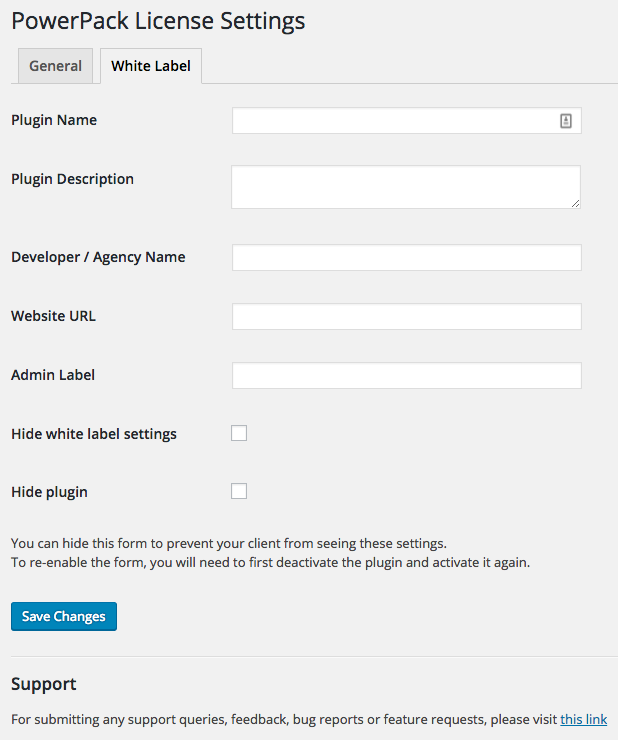
White Label Features
Are you a freelance designer / developer, an agency owner? Then this is a feature that you are going to love! With White Label options you will be able to
- Change the Plugin Name as it appears on the plugin page in WordPress admin
- Change the Developer’s Name to yourself or your agency.
- Change Plugin Website URL to your website.
- Change the Plugin Settings Label to anything you like. Usually, it’s good to keep it same as your Plugin Name.
Can my client see the White Label settings page?
Not at all! We understand that sometimes clients have administrator level access. You won’t like it if they discover the white label settings page. To prevent them from happening, we have added an option to hide the settings form once you have saved and updated your details.
You can get the form back by deactivating and re-activating the plugin.
But, wait, I don’t want my client to see the plugin
Alright! Our dear Beaver will hide from your client. You can do this from White Label settings form. Just check the box to hide the plugin and it will be invisible from the plugins list. This is the best way to avoid your clients from seeing the plugin or accidentally deactivating it and breaking the site.
See, the Beaver is now smarter!
Modal Box Module
Modal Box module has been in works for about 3 weeks now. We wanted to make it powerful, flexible and easy to use. Finally, we are happy with what we have built and ready to share it with you. It’s completely mobile responsive.
Colin Cartwright at Dynamik Beaver has done a very nice video tutorial about the Modal Box that you should check out.
Different Modal Types
With Modal Box you can have 3 different types of popups on your page.
- Auto Load – Set a delay and the popup will appear after the given duration.
- On-Click – The module allows you to display a Button, which can be clicked to load the modal box.
- Exit-Intent – Yes, exit-intent popup! This will appear when a site visitor is about to leave the site.
Now, you can increase your generate more leads easily without any extra costs.
Multiple Content Types
The modal box module supports different content types which are:
- Video
- Image
- Raw HTML
- WISWYG Content Editor
- BB’s Saved templates / rows / modules
Now, you can create a sign-up form or contact form, save the module and use it inside the Modal Box. Isn’t that cool?
Modal Box Sizes
You can create a custom size modal box by setting up the dimensions or a full-size modal box. Use it, the way you like it.
Styling Controls
All the styling options are available at a click. You can change color, background image, padding, margin, font, everything that comes with the modal box.
So, that’s all from our Beaver today. We are working on UI enhancements and some more add-ons which are listed below.
- Content Grid – will allow you to query and showcase any content from your site easily with great styling options and AJAX filters.
- Hover Cards – Add stylish content with hover cards styling.
- Timeline – Display your content in a timeline format.
- Dual Button – This is a nifty module to display two buttons at the same time. Similar to what we have done in the feature section of our home page.
- Gradient Backgrounds – Ever wondered how you can easily add gradient backgrounds to rows and columns? We have built a module for that as well! Watch out for the next release.
- Expandable Rows – Add a toggle to your entire row and open it up in a drawer style. This is really useful to embed contact forms or maps. Save space while keeping the rows actionable.
- Alert Box – Just another tiny module to add simple alert and notification boxes in your content.
- Announcement Bar – Boost your conversions or display special offers to your visitors. Hook the bar at the top or bottom of the screen.
And our little Beaver is not stopping there! After launching these modules, we will be releasing ready-to-use page & row templates and theme presets built with Beaver Builder.
A few more interesting posts →
3 Comments
Leave a Comment

PowerPack Beaver Addons
Start creating beautiful websites with 65+ modules and 350+ templates for Beaver Builder.
Having white label options changes everything. With Beaver Builder agency license this is a natural fit. Thanks.
Hi there, I can’t work out how to get a gravity form on modal pop up. Please advise.e
Hi Luke,
You can use the Modal / Popup Box module with “Content” and place the Gravity Form shortcode in the WISWYG.
If you need help, please feel free to send us a message through the contact form. https://wpbeaveraddons.com/contact/
Thanks!