🤩 PowerPack Update: Introducing Card Slider Module for Beaver Builder!
Last updated August 26, 2020 · Priyanka

The way you display information on your websites plays an important role! In the age of advanced design and technology, it is necessary to showcase website content in a way that it attracts more visitors & helps you to stand ahead of your competition. This might be a challenging task if you are not an experienced developer. To fulfill this challenge, the PowerPack team brings you a creative content module for your beaver builder websites: Card Slider Module!
This module helps you display content on your websites in an impressive card slider format without writing a single line of code. Loaded with advanced features & functionalities, the card slide module allows you to design fully functional sliders on your websites.
Let’s take an overview of the module:
Card Slider Module for Beaver Builder

You can create a stylish card slider to display information on your website. It automatically fetches your websites’ blog posts and displays them in card slider format. Further, you got the advanced query option to filter the posts you want to show on the slider.
If you want to display any other content apart from your blog posts, you can that too! Card Slider Module gives you complete flexibility to create card sliders with custom content such as Image & Text. You can add content in the card slider and later customize it the way you want, and for all that you don’t have to write any single line of code!
Features of Card Slider Module
Just like all other PowerPack modules, Card Slider Module also contains advanced customization and styling options. Let’s take a look at them one by one.
- Display Dynamic and Custom Content
- Advanced Slider Controls
- Power of Custom Query
- Easy to use & lightweight Slider Plugin
- Extensive Styling Options
- Mobile Responsive
How to Use Card Slider Module?
Just like all other PowerPack modules, setting up the Card Slider module is quite simple. Let’s see how you can display content on your website with Beaver Builder and PowerPack’s Card Slider module.
Customization in General Tab
Before we proceed, make you have installed and activated Beaver Builder & PowerPack Beaver Addons on your website.
First, open the page in Beaver Builder editor. Now drag and drop the Card Slider module on the page.
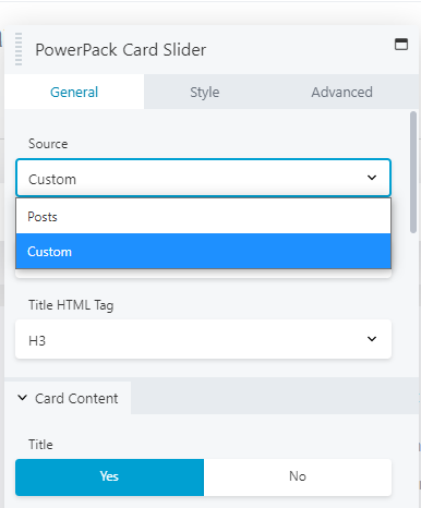
From the Source Tab, you can either choose Posts or Custom as a content source for your card slider. If you choose Posts as a source, you will see your recent posts showing up on the slider. With source type as posts, you get the flexibility to:
- Link the respective post to Title, Image, Button, or Box.
- Define the number of posts that you want to display on the slider.
- Enable disable card title.
- Enable disable image display.
- Enable disable excerpt, post meta, author, and date.
- Set a custom icon for the Author and Date.
- Change the slider speed, auto play speed
- Enable disable and customize the pagination.
Powerful Query Control for Posts
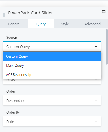
PowerPack Card Slider Module supports three main query options, Custom Query, Main Query, and ACF Relationship.
Custom query helps you to filter your posts based on Categories, Tags, and Author.
Customization in Style Tab
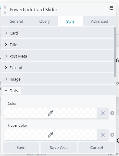
With Style Tab, you can change the look and feel of the slider. You get complete customization options to style and design slider as per your choice. Some of the styling options of the card slider module are:
- Styling options to change the look of the card, image, button, and navigation dots in terms of color, size, etc.
- Flexibility to customize height, width, typography.
- Options available for image customization such as image radius, direction.
Winding it up!
I hope you like and finds the PowerPack Card Slider Module useful. Along with this, you get 100+ other creative modules and 300+ professionally designed full and section page Beaver Builder templates.
Click here to Get PowerPack now!
What you think about this new addition, let me in the comments section, or you can share your thoughts in the PowerPack Facebook Community as well! 🙂
A few more interesting posts →
4 Comments
Leave a Comment

PowerPack Beaver Addons
Start creating beautiful websites with 65+ modules and 350+ templates for Beaver Builder.
Will this work with Custom Pots Types?
[…] Fancy Card Slider module added to PowerPack for Beaver. […]
The module doesn’t work correctly on mobile firefox & safari. The height is computed over 10000000px.
Hello Anke,
Please reach out to our support team so that we can check what’s going wrong.