Presenting the Brand New Website Layout!
Last updated August 9, 2017 · Yashwardhan Rana

Did you notice something new? That’s right! We have upgraded to an entirely epic brand new layout!
I am super excited to announce the launch of the brand new layout of our website.
This bad boy is a huge jump in terms of looks as it has enhanced the user interface and added a pleasing design that is really addictive!
Quick Look Back
We have traveled a long way but the journey is just beginning.
Whenever we look back, that nostalgic blue color scheme will always tell the story of how far we have come and where we now stand 🙂
When we started off, we were just a team who wanted to create something amazing. PowerPack started out as a product of a small yet a mighty team from a tier-II city in India which helped more than 6000 people in building their website, we surely have come a long way. Do you want to know what the website used to look like in the past?
Our Success
Ah! It almost feels like it was yesterday when the PowerPack was launched. We have grown a lot since then as we have served more than 6000 customers within a year. We always believe in giving back to the community, so we made 4 Contributions to WordPress Core, 4 Contributions to Beaver Builder Plugin and 5 Contributions to Beaver Builder Theme. All these contributions included major bug fixes, enhancements as well as new features.
We take great pride in saying that since our inception, we have designed more than 250 template layouts and almost 50+ modules. Now, that is something worthy enough to be called the PowerPack.
What’s New?
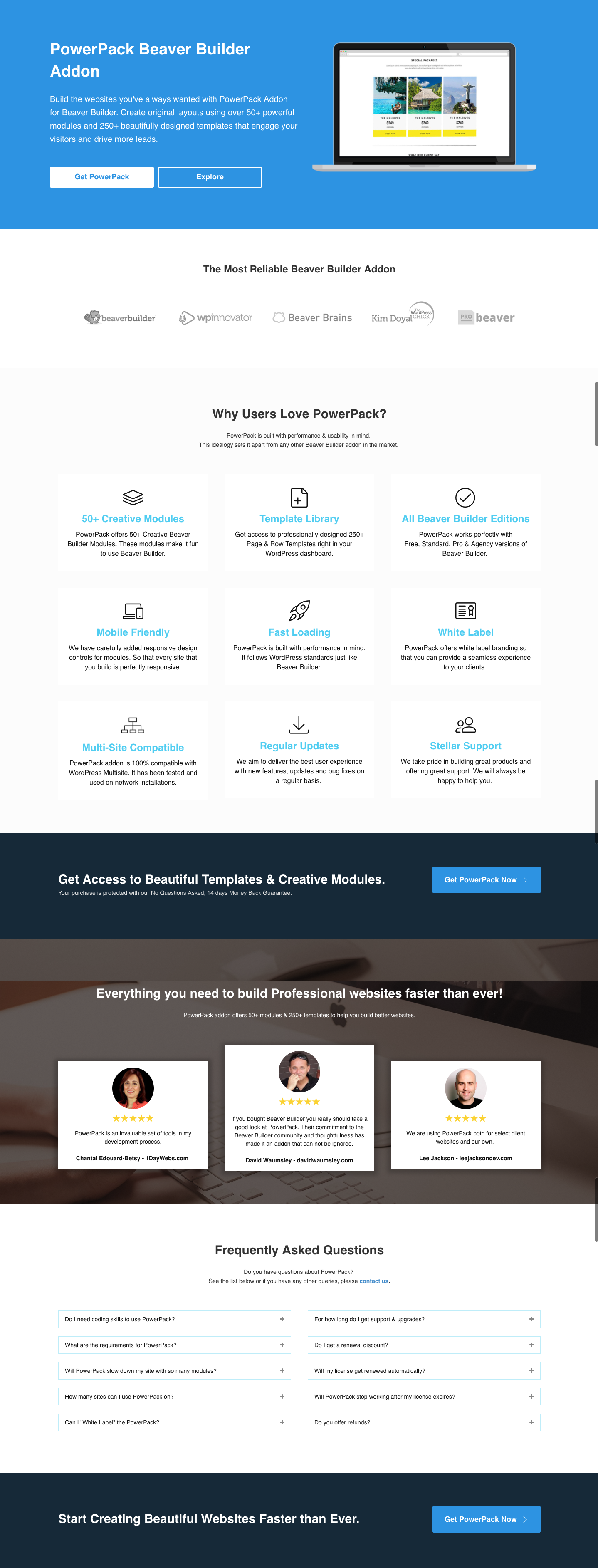
Well, of course, you can see that we have upgraded the color scheme from Blue to Red Peach and it looks amazing! Isn’t it?
The whole website got a new makeup and new professional identity that can grab anyone’s eye and is blazing fast! The new interface is made keeping in mind the ease of access to the user. Every item is placed strategically so that user has the most enjoyable experience on the website. We have even upgraded the typography on the website to improve the readability of the website, and it looks stunning!
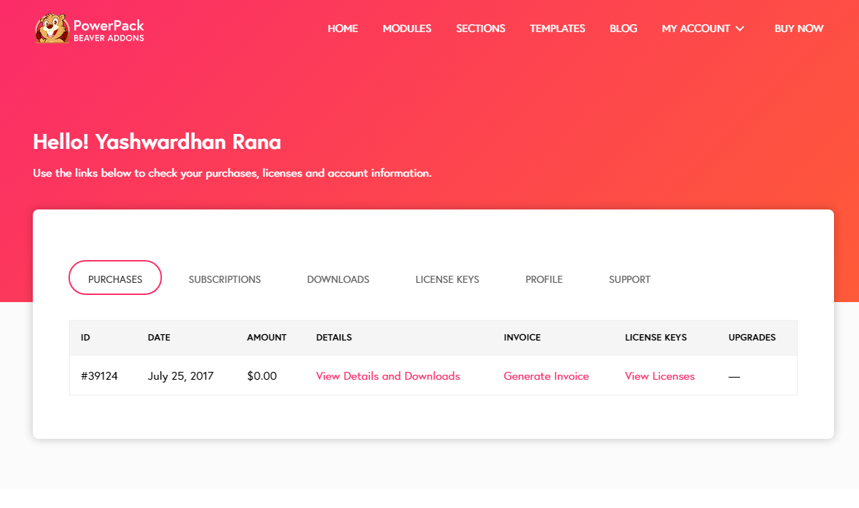
My Account Page
Did you notice that we have turned the whole My Account page upside down? Instead of having the side menu, we have upgraded to the top bar menu and the page is more responsive than ever. This hassle free impressive layout is much more easy to navigate and access your account. Here is a screenshot of our new My Account Page –
Technical Design Features
This classic layout is the result of the Beaver Builder + Beaver Themer + Beaver Builder Theme and of course, our own PowerPack Beaver Addons. From top to bottom, no coding was required at all since we have these powerful tools at our disposal. The Beaver Builder took care of the content area whereas the Beaver Themer and the Theme managed the Header, Footer and Sidebar area.
Website Design Features
With the layout, the site is updated as well. We have introduced more module demos in our demos library. Stating the obvious, you can see the site-wide color scheme change. In addition to all this, we have improved the module navigation as well!
Check out the new Modules Navigation now!
Summing it Up!
This upgrade is a significant milestone in the company’s growth. We always thrive to deliver the best and we always will 🙂
There is one thing that I know for sure that this is just the beginning. We have made something significant, but fasten your seat belts, there’s a lot to come!
What do you think of the new layout? Do let us know in the comment section below!
Share the love!
A few more interesting posts →

PowerPack Beaver Addons
Start creating beautiful websites with 65+ modules and 350+ templates for Beaver Builder.