Introducing Image Carousel : Display for your Images in a Magnificent Way
Last updated November 29, 2017 · Yashwardhan Rana

Today I am elated to announce the launch of an impressive Module: Image Carousel. Now you can start creating stunning images display with this remarkable module and elegantly show your work.
A Picture is Worth a Thousand Words
Indeed… But it’s worth increases significantly if it is displayed in the right manner and that is what our carousel is for. The Carousel module will allow you to perfectly display multiple images with a very smooth scrolling display that is capable enough to catch the viewer’s attention.
The best part of this module is that it comes with a lot of customization! You are not limited to displaying your images in just the Carousel style, in fact, you can choose from 3 different types of layouts for your image in just a click.
Click here to check out the demo for Image Carousel module.
This is not the only epic thing about this module; there are many others as well. Let’s have a look:
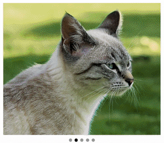
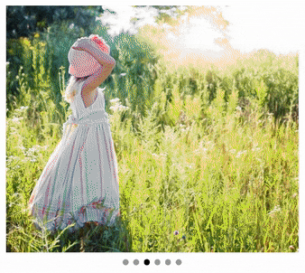
Display Layouts
Including the Carousel Style, there are total 3 different styles in which you can display your images to the users.
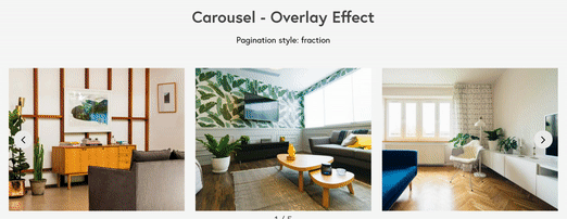
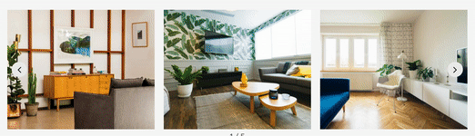
- Carousel – This style displays your images and media in an elegant yet simple Carousel style.
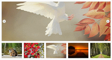
- SlideShow – This slider style displays one big(current) image or slide and multiple image thumbnails at the bottom of the window.
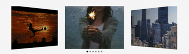
- Coverflow – This slider shows the images in a way that the slide is more focused on the central image and other side slides in the back.
Effects
Apart from the basic effect, the module allows you to choose from 2 other styles for displaying the images. You can also change the speed of transition for the images.
- Slide – This shows a simple transition effect of sliding while transition.
- Fade – This effect transitions the image by fading one by one.
- Cube – This effect displays the images in an impressive 3D Cube Effect.
Plethora of Customization
The slider has a lot of customization features enabling you to make changes ranging from changing the whole layout to adding a border. Let’s look at each customization one by one:
- Slider per view: This lets you change the number of images to be displayed at once.
- Spacing: With this setting, you can change the spacing between the images.
- Overlay Options: You can change the overlay style with just a click and you can choose to show the image caption or an icon on the image.
- Image Size: This feature gives the user the power to change the size of the images and choose from a custom size there.
- Image fit: You can make your image cover, contain, or cover the given area.
- Display Order: This lets you change the display order from normal to random or the other way around.
- Click Action: If you want your image to show up in a Lightbox when clicked or if you want to redirect the user to a custom URL when the link is clicked, You can do that as well.
- Pause on Interaction: You can make your slider to stop animation effect when the mouse is hovered on to the Carousel.
- Border Options: You can add a border to the images as well with the style settings and choose from Solid, Dotted, and Dashed.
- Transition Speed and Autoplay Speed: This allows the user to change the speed at which the transition should take place.
- Control Options: These options decide whether to show or not to show the Navigation Dots and the Navigation Arrows.
- Arrow Settings: If you choose to enable the arrow, you can change the size, color, hover color, background color, horizontal and vertical padding for the arrow.
- Pagination: These settings change the pagination type and choose from dots, fraction, progress. You can change the color, size, and round corners of the dots.
With these many options, I think you will understand the amount of customization you can make on your own carousel with the Image Carousel module.
What’s Next? Get PowerPack!
If you do not have the PowerPack, get PowerPack now! Apart from the Image Carousel Module, there are more than 50 Modules in PowerPack. And, not just that, you will get more than 250 predesigned layouts!
How do you plan on using this module? Do tell us by commenting it down below!
A few more interesting posts →

PowerPack Beaver Addons
Start creating beautiful websites with 65+ modules and 350+ templates for Beaver Builder.