How to Create Call to Action Button in Header Menu – Beaver Builder Theme
Last updated November 22, 2023 · Puneet

Call to Action or CTA buttons are very important to boost conversions on your website. Because of the same reason, our Beaver Builder Templates have many prominent Call to Action blocks and forms.
Adding a call to action button in header navigation is a common practice. A lot of websites, including our own site use the same.


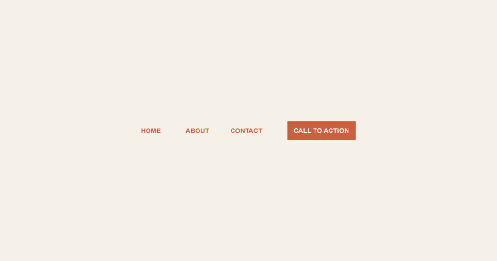
To create a CTA button like this one, you will need to add a custom class to menu items.
Go to WP admin > Appearance > Menus and click the “Screen Options” button in top right. This will open up a panel to control various elements. Enable CSS Classes, if that’s not already enabled.

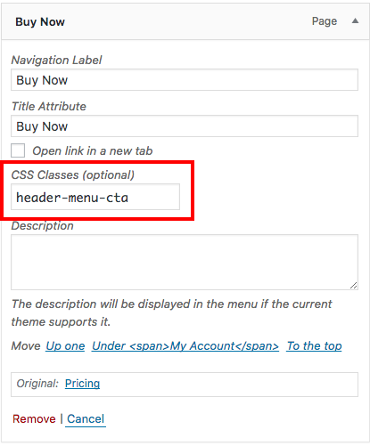
Enabling the CSS Classes option displays a new CSS Class field for Menu items as shown in the screenshot below.

I have added a custom CSS Class – header-menu-cta so that I can use the same to style the link differently.
Here’s the code that you can use to highlight this link and make it look like a call to action button.
Note: This CSS code works for BB theme menu (not Beaver Builder menu or PowerPack menu)
For PowerPack menu, please use this CSS:
.pp-advanced-menu .pp-menu-nav ul.menu > li.header-menu-cta > a {
    color: #fff;
    background: #2d94e3;
    border: 1px solid #2d94e3;
    border-radius: 5px;
}

/* Hover button styling */
.pp-advanced-menu .pp-menu-nav ul.menu > li.header-menu-cta > a:hover {
  background: transparent;
  border: 1px solid #2d94e3;
  color: #2d94e3;
}
You can create also buttons very easily with Beaver Builder on your page. If you would like to have more control over the styling, you can try smart button module from PowerPack add-on for Beaver Builder.

Awesome code Puneet. looks great.
Tried it on a current website i just completed. How do i disable the current styling on the menu for new cta link ?
http://www.gvrcoatings.co.za/
Hi Geoffrey,
You can use the following CSS
.fl-page-nav-right .fl-page-nav-wrap .navbar-nav > li.header-menu-cta.current-menu-item > a{ color: #fff; }ul.navbar-nav li.header-menu-cta.current-menu-item { border: none !important; }
a useful snippet of css. thanks!
Awesome. Works great.
Thank you.
Thanks Alex! 🙂
Using Generatepress. Can I do the same? I don’t see the styling.
Hi Jay,
GeneratePress will have different CSS classes to target. This one is only for BB Theme. I will write the same for GeneratePress as well 🙂
Where do I save this CSS file or where should I paste that code in? I don’t see that in this guide.
How do you maintain the button’s position when the header menu is collapsed on scrolling down. I’m having it move, unlike how it is on this website. Thanksl
Hi Jurgen,
We are using Sticky header option from BB Theme.
Hi there,
How do you make it so the call to action button when clicked brings up a pop up subscription that sits overtop of the homepage rather than taking you to a complete page?
Hi Haley,
You can refer to our previous post → https://wpbeaveraddons.com/site-wide-popup-box-beaver-builder/
You can hook the modal box on all the pages using some PHP and set the trigger option to “Other” which will provide you a CSS Class that you should add to the CTA Button.
Thanks!
Hi,
this is a great tutorial and I have used it on a few websites. Thank you 🙂
I have an issue in that when the website menu adapts for mobile the CTA button, changes colours.
For the life of me I can´t figure out how or where to adjust these..
I am trying to get it appearing with the same colours as on the desktop version of the site.
Background Orange Hover becomes Grey
With constantly white text.
Many thanks in advance for any suggestions
This is a very useful bit of CSS! Thanks!