How to Create Dual-Button CTA using Beaver Builder
Last updated October 13, 2016 · Puneet
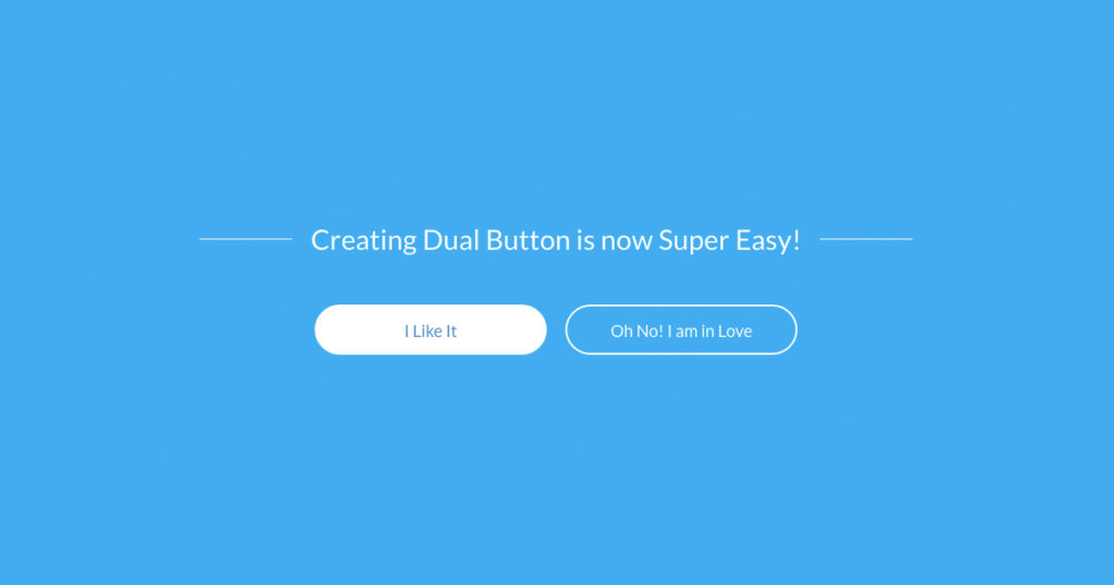
Last week, I wrote about creating a call to action (CTA) button in header menu for Beaver Builder Theme. Following the series, today I would like to share a tip for creating dual button call to actions using Beaver Builder.
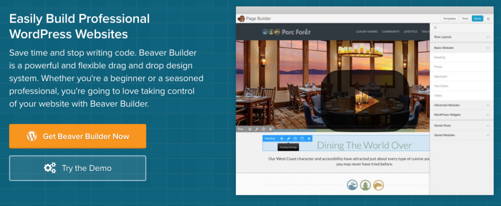
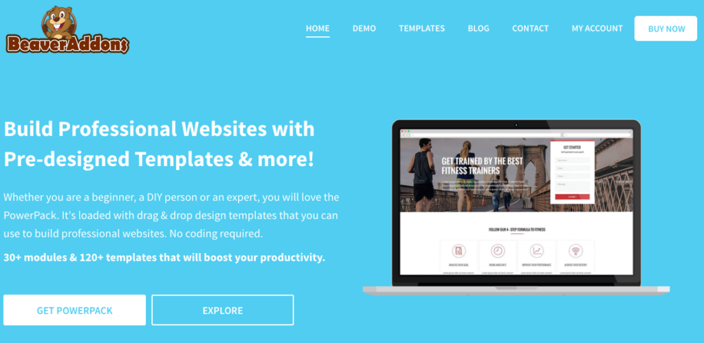
Dual button Call to Action button is useful when you want to showcase your product and also offer the users a chance to signup. Here’s an example of how Beaver Builder website uses it.
How to Create Dual Button with Beaver Builder
Beaver Builder provides a button module that allows you to create and style buttons easily. The good thing is, this button module is available in the free (lite) version as well.
First of all, you need to add a 2-column row layout to the content section, as shown below.
Next, add the button module in both the columns and style them as per your requirements. I have created a flat button and another one as a transparent button.
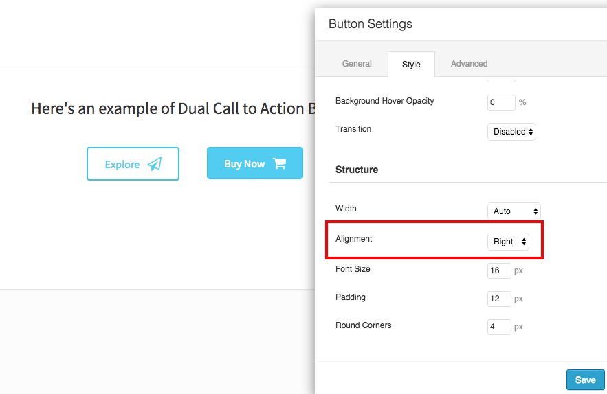
So, if we look at the screenshot, Buy Now buttons looks fine. All we need to do is move the Explore button to the right. For this, simply click the button to open button module settings and change the alignment to Right as shown below.
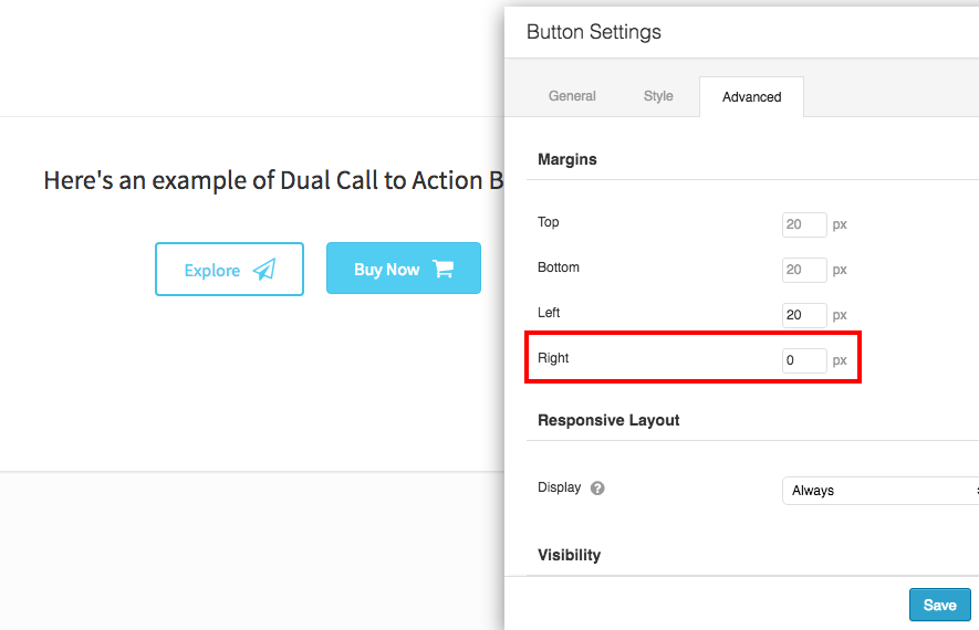
As you can see, now both the buttons look balanced and center aligned. In order to reduce the gap between the buttons, we can adjust the right margin for the first button to zero or second button’s left margin to zero.
Create Dual Buttons using PowerPack add-on for Beaver Builder
So, this was how you can create dual buttons using Beaver Builder. Although, it works well but it turns out to be limiting sometimes. For e.g., if you would like to create something like the screenshot below, the above method will need some custom CSS as well.
That’s because Beaver Builder currently doesn’t have nested columns, which will be available in version 1.9
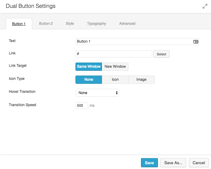
If you are looking for more control over styling and creating dual button easily then you can look at Dual Button module from the PowerPack addon.
This module provides you with easy to use options for styling and can do much more than the default Button module.
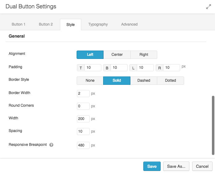
Style Options for Dual Button Module
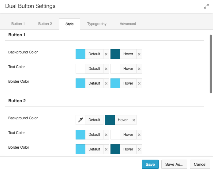
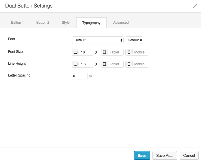
PowerPack Dual Button Typography Options
and here’s the end result.
You can check more examples of the Dual Button module on this page.
Join our Facebook Group
You can join our Facebook Group for more updates and tutorials about Beaver Builder and PowerPack add-on.



Is it possible to have transparency on your Dual Button module?
Hi Belinda,
This can be done with CSS.
Instead of using HEX code for background color, you can use RGBA format.
background: rgba(255,255,255, 0.2);In above example, 0.2 is the opacity and rest is the color code in RGB format. I hope this will help.
Thanks!
If you want to have a contact button for mail and telephone. Does your pc/laptop/tablet require to have Skype so the button for telephone will work? Or does it have to work anytime? I know used: mailto: and tel: for the buttons, but the tel button doesn’t always work.
Chantal,