How to Style Contact Form 7 with the Beaver Builder
Last updated July 28, 2017 · Yashwardhan Rana

Sometimes you might require more fields and extra functionality on your Contact form. In that case, you would like to use a contact form plugin like Contact Form 7. Contact Form 7 is a popular, easy to use and free contact form plugin for WordPress.
Beaver Builder also has its own Contact Form Module but only has standard fields – name, email, subject, phone number, and message. Beaver Builder doesn’t come with a Contact Form 7 module, so you will need to style it via custom CSS which is a time-consuming and coding oriented task.
To solve this problem and save your time, PowerPack Beaver Addons has a sleek Contact Form 7 module. This module is available with both Free & Pro versions of PowerPack.
Get the Free Version of PowerPack from WordPress.org
How to Style the Contact Form 7 using PowerPack?
First of all, before we begin, let’s make sure that we have the Contact Form 7 & the PowerPack Addon Plugin installed on the website dashboard. If you have them, then we can proceed!
How to add Contact Form 7 using Beaver Builder
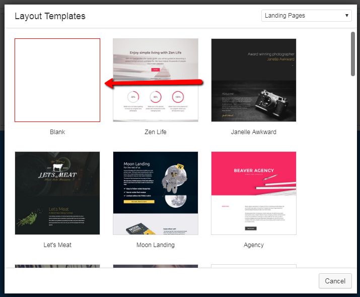
Step 1: Open the Page Builder and select a Blank Layout.
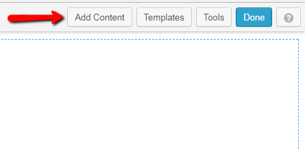
Step 2: Click on the Add Content Button at the top right corner of the page.
Step 3: Go to the PowerPack Modules option and find the Contact Form 7 listed there.
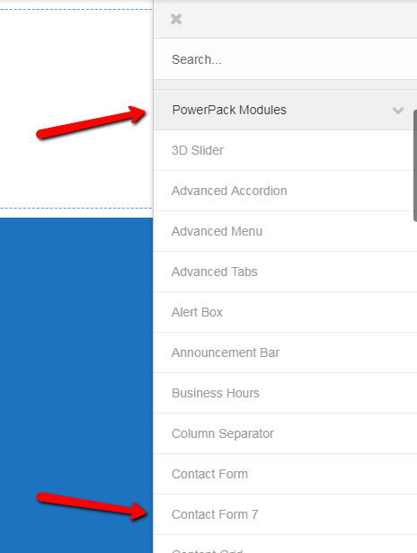
Step 4: Simply Drag and drop the form on the page.
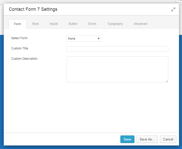
The Contact Form Settings will show up.
Congratulations! You have successfully added the Contact Form 7.
Now let’s learn how can we alter it.
Styling your Contact Form
There’s a lot you can do with the Contact Form with the PowerPack. To make changes in the styling of the Contact Form, we need to access the settings of the same. You can do it by clicking on the little wrench icon in the corner or by just clicking on the contact form itself.
When you initially drag and drop the Contact Form, you will see a window like this.
The first thing you need to do after adding a Contact Form Module on the Page is Selecting a Contact Form from the list like this.
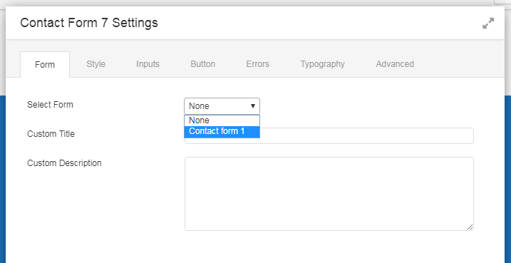
As soon as you select the form, the form will load in the background in real time.
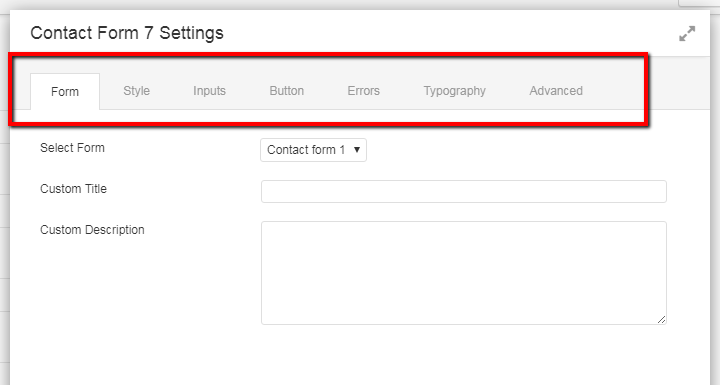
Now there are 7 Tabs in the Contact Form 7 Settings- Form, Style, Input, Button, Errors, Typography, Advanced. Let’s understand each one-by-one.
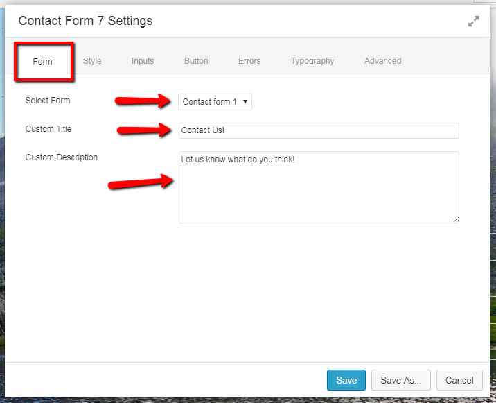
Form Tab
Form Tab lets you select the Form to be displayed, the Form Title and Give a description to it. You can just choose the Form from the Drop Down List and enter the name and description and click Save. Here’s an Example.
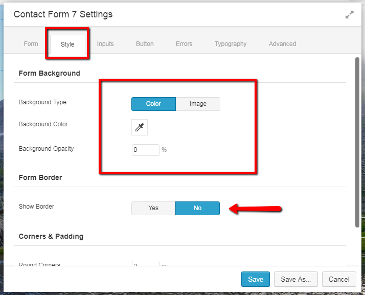
Style Tab
The style tab lets you alter the form as a whole. It has three sub sections.
- Form Background – If you want to choose the form background color or set an image as a background, this option will fulfill your needs. To make a picture as your background then just click on the image button, upload the picture, and it is done. If you want to set a background color just select the color button and choose from the color palette or enter the color code.
- Form Border – The Form border is self-explanatory. It lets you set a border to the whole form. You can select the border color, border width and border style(dashed, dotted or solid).
- Corners and Padding – The corners set the value for the curve for the edges of the individual cells, and the padding is the value which represents the space between each element. You can easily set them a value, and they will take effect in real time.
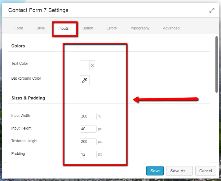
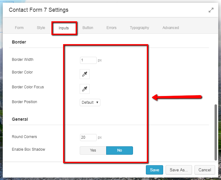
Inputs Tab
In the Inputs tab, you can change the styling of the Text Fields. You can make them small, big, curvy, sharp, colorful etc.
- Color – This panel helps you in setting the Text Color and the Background Color of the Text Fields.
- Sizes and Padding – This section helps you in changing the size of text fields as well as Text Area. You can alter the space between another element with respect to the top and the bottom margin.
- Border – As the name says, this option helps you in altering the boundary of the Text Area and the Text Box. You can change the Border Width, Color, Color Focus, and even the position of the border.
- General – It has two options, first is giving round corners to the input boxes and the second is enabling the box shadow. You can easily change these setting by entering the value for the rounded corners. Greater the value, the curvier the rounds.
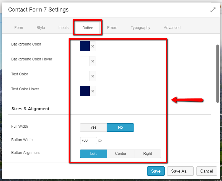
Button Tab
As the name says, the button tab helps you in changing the appearance of the button and the functionalities.
- Colors – This section defines the color of the button as well as the color of the button and the text when you hover over the button. You can easily change the color by choosing the color from the color palette.
- Size and Alignment – If you want to alter the width of the button end to end then set the Full-Width option to “Yes” else just select “No” and enter a custom width in the field below and the position of the button from left/center/right. The button will adjust automatically.
- Corners and Padding – This option is useful when you want to make the edges of the button round. The Top/Bottom, as well as Left/Right padding, can be increased or decreased by simply entering the value.
- Border – Here also, you can select the width of the border. You can also set the color of the border and the color of it when someone hovers over it.
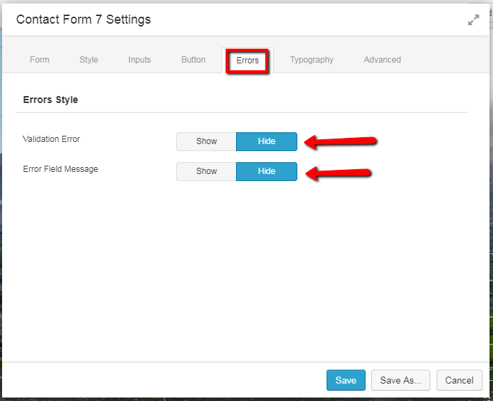
Errors Tab
This tab defines the behavior when some error occurs during the submission of the form. For example, if the “Email ID” field is not supposed to be left empty and the user accidentally clicks the submit button without entering anything there. These functions will come into action, and the user will see a message if you enable it.
The Error Field Message changes the color of the field that has an error in fetching the value. You can disable or enable it and choose the color of the error field as well.
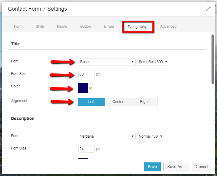
Typography Tab
The Typography Tab lets the user change the Font style, color, size, alignment, etc. This Tab has all the customization freedom for all the different elements individually such as Title, Input, Label, Button & Description. This is pretty obvious to understand yet I will take a moment to explain the different attributes of this tab.
- Font – This lets you choose from 500+ different Google fonts as well as system fonts. Just select the one you like from the drop down list, and it will take effect immediately.
- Font Size – The size of the font that you selected. Just enter the value, and it will take effect immediately.
- The color of the font – It lets you choose the desired color from a palette or just enter the color code.
- Alignment – Alignment defines where the text is placed i.e. Left, Center or Right.
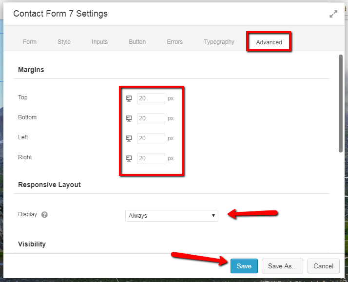
Advanced Tab
Under the Advanced tab, you get to make changes in the whole form itself. Changes like the margins, responsiveness, visibility, Animation, etc.
- Margins – They defines the distance between the form and other elements in each direction.
- Responsive Layout – It tells the code with what device the responsiveness of the form will come into action.
- Visibility – If you want to make the form visible only when the user is logged in, then this is the option. You can set when the form is visible to the user or not.
- Amination – If you want your form to fade in or Slide in then this option will do the thing for you.
- HTML element – It let you define custom HTML & CSS class if you want to make additional changes to the form.
This concludes the functionality of the whole Contact Form 7 and Just by editing these settings you can make a fabulous looking Contact Page.
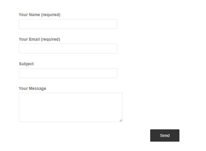
Here is the default Contact Form 7 without any editing.
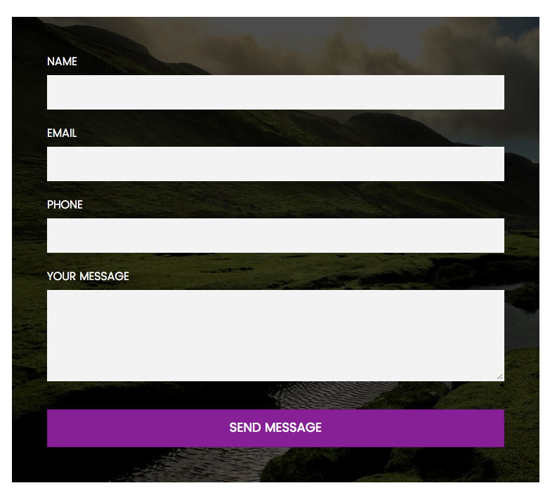
I took the form above and spent barely 5 minutes in altering the PowerPack Settings and here is the Result. Looks pretty impressive, right?
Concluding
If you want to make a Contact us page as epic as the one above then get your hands on the PowerPack today. Apart from Contact Form 7, you get 50+ epic Content Modules and 250+ Templates. You can either get all the features with Pro version or just download the Free version from WP.org.
Just to let you know once again, Contact Form 7 module is available with Free version of PowerPack.
A few more interesting posts →
9 Comments
Leave a Comment

PowerPack Beaver Addons
Start creating beautiful websites with 65+ modules and 350+ templates for Beaver Builder.
Too bad we can’t still put the forms inline.
Thanks for the tut.
We are adding that feature in the next release 🙂
Hi Puneet, when can we expect the new feature? 🙂 (inline)
Hello Rene,
We have an update scheduled for the coming week. So, we will have the new feature available then.
Is placeholder text coming in the next release?
Hi Jen,
Do you mean styling for the Placeholder Text?
Hi there. Is this possible to build a form on two columns with the free version?
Multicolumns would be very nice. Needed for longer forms.
How do I style the font colour of the output text? Mine is light grey on a white background and I can’t find a place to fix it.