[How To] Build a One Page Website with Beaver Builder
Last updated October 13, 2016 · Puneet
One page websites are in-demand these days. A great advantage of a one-page site is that you can keep it to the point. It’s good if you offer services where you don’t want to confuse the users with various options.
In this tutorial, I am going to share how you can build a one-page site with Beaver Builder & PowerPack addon.
One Page Website with Beaver Builder
Beaver Builder comes with a bunch of modules to help you speed up your development process. One module that we found missing was a One Page Navigation or a Dot Navigation module. Coincidentally, we also received a feature request from one of our users – Larry Shinagawa for this module.
Laying out the page structure
To build one-page site, you will need to first add all the rows and content blocks to your home page. This can be done by using Row Modules that Beaver Builder provides under Row Layouts.
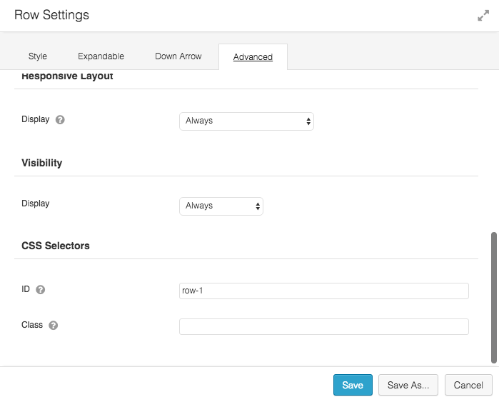
After adding the row, navigate to the Advanced Tab and add a unique ID to the CSS Selectors section. I usually prefer to keep this easy by using a sequential ID. On our demo page, we are using ID row-1
Using a number for the ID also makes it easier to figure out the row’s location on the page. It’s best to use small letters and avoid any blank spaces.
Each Row on the page needs a unique CSS ID. This Row ID will be later used to link the dot navigation module with the Row.
Adding the Dot Navigation Module
So, we are done with adding rows to the page and setting a unique CSS ID for each row. Now we can add the dot navigation module to the page and set it up to work with our rows. You can drag the Dot Nav module from the list of Beaver Builder Modules and place it any row of your choice. In our demo, we have added it to the first row.
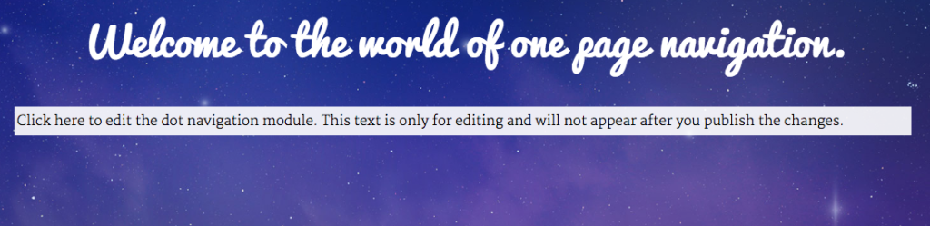
Whenever you edit the page with Beaver Builder, you will see a placeholder text shown in the image below. This placeholder text allows you to locate the dot navigation module and edit it.
Setting up the Dot Navigation Module
Dot Navigation module has tons of options for styling & customization. Here’s a screenshot of the General Settings Tab.
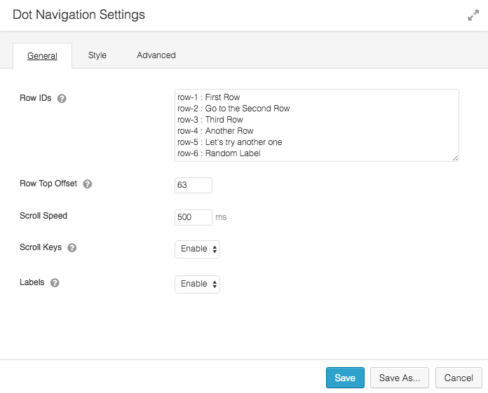
Row IDs
This is where we need to add all the IDs of rows on the page. This will generate the output for dot navigation and link each navigation item / menu item with respective Row.
Row Top Offset
You can use this option if you have a sticky header on the page. This value should be equal to or greater than the height of the sticky header. It prevents the header from overlapping the row content.
Scroll Speed
This option is used to control the transition speed when moving from one row to another.
Scroll Keys
If you want to allow users to navigate from one row / section to another row / section using up and down arrow keys, you can use this feature.
Labels
The text that appears after the colon in Row IDs box is used to display Labels for Navigation Items. The labels appear on hover.
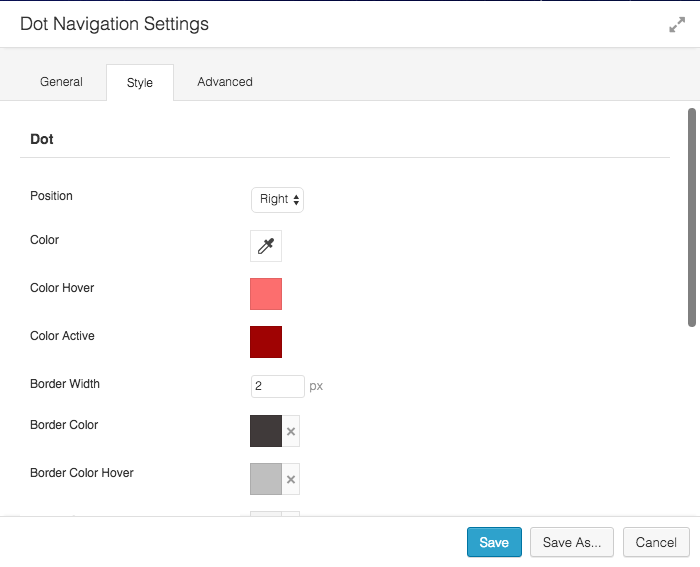
Styling the Dot Navigation Module
After setting up the navigation, let’s move to the Style Tab. It allows you to customize the colors for navigation dots and change the color for label text and background. You can also change the size of navigation dots.
Save & Publish
Once you are done with setting up the module and styling it, click the Save Button. Finally, publish the page.
Demo
Click here to view the demo for dot navigation module.
A few more interesting posts →
10 Comments
Leave a Comment

PowerPack Beaver Addons
Start creating beautiful websites with 65+ modules and 350+ templates for Beaver Builder.
Hi!
why the dot navigation is not responsive? I would love to use it but I can’t see it in my phone. Would you make the dot navigation responsive?
Hi Miriam,
The dot navigation gets turned off on mobile because of the lack of space on small screens.
Also, the dot navigation is used for scrolling on the same page which is a natural way of browsing websites on mobile devices.
Instead of auto-disabling this, we will add an option to manually enable / disable the dot navigation on mobile devices. 🙂
I’ve just done a trial set up of this module after a feature request from a client that I didn’t think I was able to deliver. Now I can!
Thank you Puneet and the team, it work great. I love it 🙂
Gerry
Is it possible to scroll to next row automatically using the mousewheel and not clicking on the dots? So that when scrolling with the mouse you scroll completely to the next row.
Hi Rene,
It’s not possible at the moment. But, we will add that functionality soon.
UPDATE: Complete Row Scroll functionality is now available with the Dot Navigation module.
Hi,
I noticed that under Row>Advanced, there is no CSS Selectors. May I know how can I make it appear? Thank you.
Hi Travis,
If you check “Advanced” tab, you will see two input fields for CSS Class and CSS ID. You will need to add a custom CSS class there.
Hi, i checked your link https://wpbeaveraddons.com/demo/dot-navigation/. But did not find this module in my modules list. I have purchased UABB modules.
please help.
Hi Urvi,
One Page Dot Navigation module is a part of PowerPack addon for Beaver Builder. You can get it here: https://wpbeaveraddons.com/pricing/